Monday, 30 March 2015
Thursday, 19 March 2015
Monday, 16 March 2015
Coursework Evaluation // Q.1-"In What Ways does your media product use, develop or challenge forms and conventions of real media products?" [Music Video]
[VIEW MY MUSIC VIDEO HERE]
My music video makes wide use of generic conventions: using challenging, and developing the conventions of the genre.


Some of the technology featured in the video.
The genre of my music video is in many ways a reflection of the Dance and electronic genre of my artist. The Dance and Electronic genre is most obviously reflected in the prominent use of props centring on technology, such as the iPad character and the laptop at the start. One convention of the Dance/Electronic genre is the use of props relating to the genre of science fiction as well as other aspects of the genre.Examples of this include use of aliens, robots and technology in the mise en scene of their music videos, for example with daft Punk's music video for 'Harder Better Faster Stronger'. This helps the music video to appeal to fans of the science fiction genre, and signpost some of the other aspects of the video. This immediately helps the audience to understand the music video better, as well as helping to promote the artist and track. However, the sci-fi elements do not necessarily dominate the mise en scene of the music video, which also utilises genre conventions from romantic comedy. As well as by conforming to traditional romantic comedy narrative, the video uses romantic cliches (such as the rose petal scene) and use of lighting, composition and mise en scene of the genre to communicate the genre. An additional comedy trope I have referenced is that of the comically tragic hero, the type of which has been immortalised by characters such as Charlie Chaplin and Truman Burbank. My main character is a tragic hero in that he initially appears to the audience as comically foolish and unconventional, but later becomes more and more heroic and endearing. The main character also possesses many similarities to the character of Truman Burbank, who also lives in a world of fantasy. The effect of the use of these genres is to attract their respective audiences and help provide audience pleasures. The ironic take on the 2 genres also helps to give the video a 'cool' edge, which will help to attract my target audience. This both uses and develops dance conventions, as unlike some other genres such as metal, Dance videos tend to be much more varied in their content, some consisting of dance/performance, some of more traditional narrative, and some of more abstract montage and visuals.They more typically align with the tone or mood of the song, rather than genre, and the tone of the track I produced the video for was upbeat and funky, so I aimed to reflect this in my offbeat, but ultimately light music video.
Friday, 6 March 2015
Print Productions Planning // Similar Album Covers.
Before I start to properly plan out my Digipak print production, I felt it would be useful to conduct a little research into the artwork of bands of a similar genre to the Artist/track I produced the music video for, Vanilla. The track I made the video for ('Suede') is a very upbeat and disco influenced track, so I have chosen artwork from contemporary bands and artists who make disco or disco influenced electronic music. I hope that by looking at the aesthetic and font choices of some of these album covers, I will gain some form of inspiration and inform my designs.
Daft Punk-Discovery
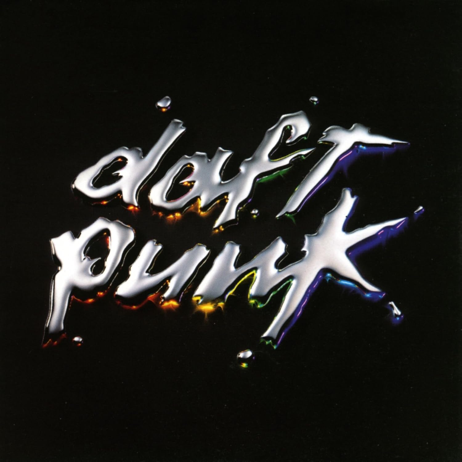
This is the cover art for the album 'Discovery' by the French Dance producer duo Daft Punk. This album is mainly comprised of high-energy upbeat dance-pop with disco and funk influences. It was produced and composed entirely electronically, with use of synths, vocodered vocals and samples dominating the make-up of the album. This is reflected with the simple artwork of the Daft Punk logo, as used on the majority of their studio albums, rendered in a metallic liquid, with a subtle multi-coloured under-glow. The reflective liquid reflects the bright, futuristic electronic production of the album and its high quality pop sheen, with the subtle colour connoting the albums varied but upbeat song writing. It is a very minimalist album cover, but a striking one. It is a highly artificial image, not aligning with any particularly obvious real world context, but an aesthetically pleasing one, and this reflects the artificially composed nature of the music. It is a meticulous cover for a meticulous album, with a very strong identity, and the two go together perfectly.
Breakbot-By Your Side
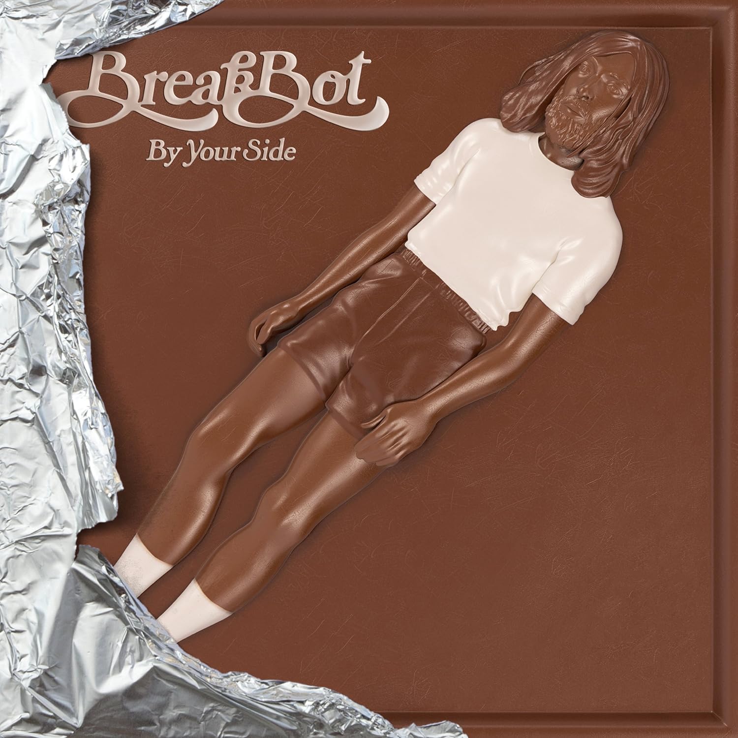
This is the cover art for the album 'By Your Side' by French Disco/Electro artist Breakbot. Like the other two albums, it is a disco influenced electro-pop album, but incorporates a more organic and lively orchestrated aspect. Where as the other two albums rely more on the use of synths and samples, By Your Side's compositions include many live sounding instruments, with samples of bass guitars, strings, piano and other acoustic instruments featuring in the mix. In addition, the song writing takes a more laid-back and luscious tone, creating chilled out funk love songs with various vocal collaborators. This is all reflected in the artwork and packaging, which presents the album as if it were a half unwrapped chocolate bar. This artwork, itself a variation on a common theme throughout Breakbot's artwork [2] [3], and helps to maintain and attract Breakbot's loyal audience. It connotes the smooth and rich tone of the album, and its complex instrumentation, by suggesting the rich, smooth taste of chocolate with the chocolate texture. It is also a very aesthetically interesting and alluring cover, playing with the very concept of album artwork itself by packaging it as an entirely different product. I feel it is a very successful and interesting cover and will consider it when designing mine.
Cut Copy-Bright Like Neon Love

This is the cover art for the album 'Bright Like Neon Love' by the Australian Synth-Pop band Cut-Copy. The genre of this release can be best described as a cross between the warm, disco-influenced electro-pop of bands like 'The Human League' and the effect pedal laden indie-rock of bands like My Bloody Valentine. The use of a woman wearing bright lipstick and sunglasses is a common electronic trope more commonly associated with the camp and futuristic aesthetic of the electro-clash scene of the mid 00's, that Cut Copy related to. This is accentuated by the use of the reflection of New York city in the sunglasses, re-enforcing the high glamour and sheen of the electro genre. The indie genre is also reflected in the cover, with the use of the photo-montage technique, which connotes the DIY aspect of the music. This is a good album cover that communicates the style of the music well, meaning it is appropriate for the purpose.
Tuesday, 3 March 2015
Print Productions // Completed Digipak + Advert
This is the completed Digipak I have produced for the imaginary album 'Suede' by un-imaginary independent British producer Vanilla. It is a simple 6 panel design that folds out and packages a single disc. With my design I wished to continue to explore the theme of how we interact with technology, with romance and with the two together.


This is the layout that I have used for my Digipak, and when explaining each panel, these are the numbers each panel will correspond to.
Subscribe to:
Comments (Atom)