In my Print production, I have used, developed and challenged many conventions of real CD cases and Adverts. I have used these conventions as a basis for my designs, but have developed on from them. The main reason for this was to fit in with the audience expectations of what a CD case should appear like and to communicate clearly the information I was trying to communicate to potential consumers.

An album cover and a magazine cover with titles positioned at the top of the image.
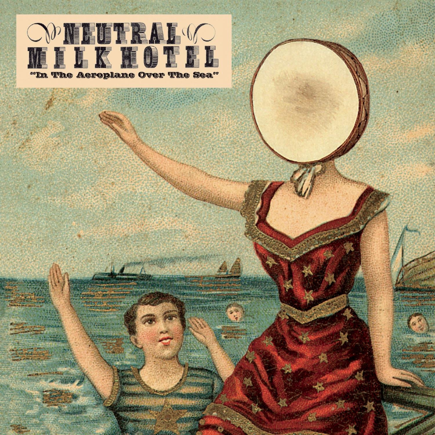
One Convention I used on my Digipak was the use and placement of the artist name and album title on the Front Cover (panel one). The use of the artist name and album title is a common convention of album artwork, across all genres. Examples of this include, among many others, Breakbot's 'By Your Side' and Neutral Milk Hotel's 'In The Aeroplane Over The Sea' [B]. This allows the artist to be promoted clearly on the artwork, helping to maintain a loyal fan-base. The fact I used the Titles at the top is also a convention which, similar to magazine titles [A] allows the title of the product to protrude over the top of others when stacked in a slanted shelf. This would help to attract potential customers, as well as signposting for established audiences.
 [C]
[C]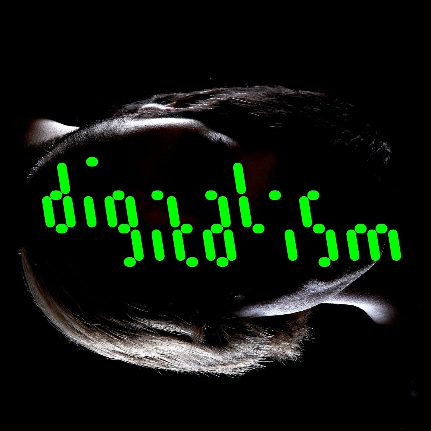 [D]
[D]
2 Covers from the dance genre featuring mise en scene relating to technology.
Another Convention I develop on Panel one of my print production was the use of mise en scene relating to technology. My panel reflects this with the use of the iPad prop and the use of highly artificial blue lighting. This a convention of the dance music genre of which my album belongs. This is similar to the use of technology in other dance albums such as Siriusmo's 'Mosaik' [C] which like my cover uses technological props, and Digitalism's 'Idealism', which utilises a LCD display-like font. However, my cover is slightly unconventional in that it features technology, whereas most dance covers of this type feature retro or futuristic technology.
Scenes from the films 'American Beauty' and 'Arthur' featuring use of rose petals.
I also used the romantic convention of the rose petal prop on my front cover and front panel. This is similar to the use of rose petals in films such as American Beauty and Arthur to connote romance, lust or passion in a scene. I did this to create an awkward but interesting disposition between the prop of the iPad and the romantic connotations. [E]
[E] [F]
[F]
2 back covers taken from real life texts.
A highly common convention I used on the back cover of my print Production, panel 6, was the convention of a numbered track listing. This is the most commonly used way to communicate tracks on album releases as it helps to interest the audience who may already know of tracks from the album, or may be able to learn more about the style of music through the track-listing. Another convention of back covers used in my production was the featuring of institutional information, such as the record label and credits, both featured in my production. However, my cover did not conform to the convention of a bar-code, which I planned would be stuck over the packaging film. These 2 back panels, taken from Deerhoof's 'Friend Opportunity' [E] and Daft Punk's Homework [F] are just 2 examples of back panels which utilise these common conventions.
 [G]
[G] [H]
[H]
2 Digipaks that use the convention of coherent central panels.
An additional convention referenced in my Digipak is that of the complementing central panels. My 3 central panels (panels 2,3+4) are all united by the single visual of TV Static, creating a constant image across the centre of the Digipak. This is a highly common visual convention in Digipaks, which benefit from the option of storing CD's and sleeve notes within the sleeves of the case itself, something you are unable to do with a jewel case. I felt this strongly tied the central panels together and fitted in well with the theme I was trying to create. These 2 albums MGMT's 'Oracular Spectacular' [G] and Tall Ships' Everything Touching' [H] show the use of this convention in real texts.
 [I]
[I] [J]
[J]The most common layout for Digipaks is a simple 4 panel design with a cradle, such as the Digipak for Boards of Canada's 'Music Has the Rights To Children' [I] but I challenged the convention of the traditional 4 panel Digipak, by making mine with 6 panels. This is not entirely atypical however, and there are many real texts that use a 6 panel design, such as the Digipak for Nine Inch Nails' 'The Slip' [J]. I chose to use a 6 panel design in order to more fully explore the ideas and themes in my Digipak.
 [K]
[K] [L]
[L]The last Digipak convention I used was that of a panel featuring credits and thanks. I used this convention on Panel 5 of my Digipak, in a way that is similar to the use in albums such as Baths' Cerulean [L] and Chilly Gonzales' 'Ivory Tower' [K]. I felt that this added to the complete feeling of the Digipak, and reflected the typical artist request for thanks and acknowledgements.
 [M]
[M] [N]
[N]My A4 Advert was highly conventional, adhering to multiple conventions. The first convention I used in my advert was the use of the album artwork in the promotion of the release. This is a common convention that helps to sell the album by showing the audience the artwork so that they may recognise it more easily. These two posters, for A$AP Ferg's Trap Lord [M] and The Prodigy's 'The Day Is the Enemy' [N], when compared to the artwork of the album's they are promoting, clearly conform to this convention.
Another Convention I use in my A4 Advert is use of core information such as release date, release formats, and record label. This is to convey the core information that the audience would want to know, in order that they are more likely to purchase the product due to the lower amount of research needed to buy the release. It also builds hype for the release and attracts particular audiences. For example, a certain audience may be more involved in a release if they know it is being printed on Vinyl, or if they are a fan of the record label that the album is being released on.
One final convention I used in my advert is the use of successful singles to promote the release. This is a common convention for adverts for releases with moderate-level reception or above, and though I do not know what kind of reception my hypothetical release would get, I felt this choice would be appropriate for the artist as it would help to better promote the release and attract a wider audience
Overall, my Print Productions were much more conventional than my music video, but still incorporated some of the unconventional elements of the music video in the design of the Digipak. This is because, to be affective, posters and Digipaks do not have as much need to tend to audience pleasures by experimenting with conventions unlike Music Videos, which attract audiences by entertaining them. The purpose of the advert in particular is mostly to communicate key information and build the profile of the release by displaying its' artwork. The images on my Digipak, although unconventional in themselves, are not unconventional in terms of Digipaks as unusual or evocative images are a convention of Album covers.
Excellent Lars, post under Label G324 Evaluation. No need for revisions.
ReplyDeleteI am unable to locate the first section of question one which is about how you used codes and conventions in your music video. Could you please post urgently if you have done this section.
ReplyDelete