Monday, 30 March 2015
Thursday, 19 March 2015
Monday, 16 March 2015
Coursework Evaluation // Q.1-"In What Ways does your media product use, develop or challenge forms and conventions of real media products?" [Music Video]
[VIEW MY MUSIC VIDEO HERE]
My music video makes wide use of generic conventions: using challenging, and developing the conventions of the genre.


Some of the technology featured in the video.
The genre of my music video is in many ways a reflection of the Dance and electronic genre of my artist. The Dance and Electronic genre is most obviously reflected in the prominent use of props centring on technology, such as the iPad character and the laptop at the start. One convention of the Dance/Electronic genre is the use of props relating to the genre of science fiction as well as other aspects of the genre.Examples of this include use of aliens, robots and technology in the mise en scene of their music videos, for example with daft Punk's music video for 'Harder Better Faster Stronger'. This helps the music video to appeal to fans of the science fiction genre, and signpost some of the other aspects of the video. This immediately helps the audience to understand the music video better, as well as helping to promote the artist and track. However, the sci-fi elements do not necessarily dominate the mise en scene of the music video, which also utilises genre conventions from romantic comedy. As well as by conforming to traditional romantic comedy narrative, the video uses romantic cliches (such as the rose petal scene) and use of lighting, composition and mise en scene of the genre to communicate the genre. An additional comedy trope I have referenced is that of the comically tragic hero, the type of which has been immortalised by characters such as Charlie Chaplin and Truman Burbank. My main character is a tragic hero in that he initially appears to the audience as comically foolish and unconventional, but later becomes more and more heroic and endearing. The main character also possesses many similarities to the character of Truman Burbank, who also lives in a world of fantasy. The effect of the use of these genres is to attract their respective audiences and help provide audience pleasures. The ironic take on the 2 genres also helps to give the video a 'cool' edge, which will help to attract my target audience. This both uses and develops dance conventions, as unlike some other genres such as metal, Dance videos tend to be much more varied in their content, some consisting of dance/performance, some of more traditional narrative, and some of more abstract montage and visuals.They more typically align with the tone or mood of the song, rather than genre, and the tone of the track I produced the video for was upbeat and funky, so I aimed to reflect this in my offbeat, but ultimately light music video.
Friday, 6 March 2015
Print Productions Planning // Similar Album Covers.
Before I start to properly plan out my Digipak print production, I felt it would be useful to conduct a little research into the artwork of bands of a similar genre to the Artist/track I produced the music video for, Vanilla. The track I made the video for ('Suede') is a very upbeat and disco influenced track, so I have chosen artwork from contemporary bands and artists who make disco or disco influenced electronic music. I hope that by looking at the aesthetic and font choices of some of these album covers, I will gain some form of inspiration and inform my designs.
Daft Punk-Discovery
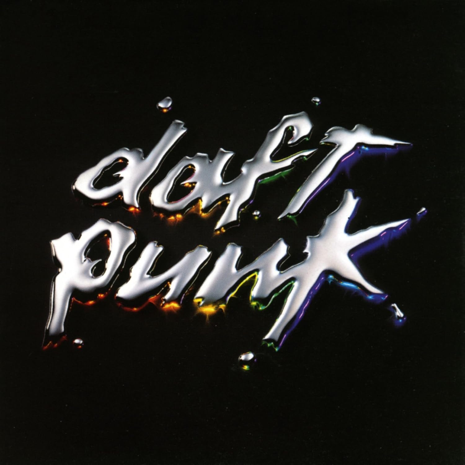
This is the cover art for the album 'Discovery' by the French Dance producer duo Daft Punk. This album is mainly comprised of high-energy upbeat dance-pop with disco and funk influences. It was produced and composed entirely electronically, with use of synths, vocodered vocals and samples dominating the make-up of the album. This is reflected with the simple artwork of the Daft Punk logo, as used on the majority of their studio albums, rendered in a metallic liquid, with a subtle multi-coloured under-glow. The reflective liquid reflects the bright, futuristic electronic production of the album and its high quality pop sheen, with the subtle colour connoting the albums varied but upbeat song writing. It is a very minimalist album cover, but a striking one. It is a highly artificial image, not aligning with any particularly obvious real world context, but an aesthetically pleasing one, and this reflects the artificially composed nature of the music. It is a meticulous cover for a meticulous album, with a very strong identity, and the two go together perfectly.
Breakbot-By Your Side
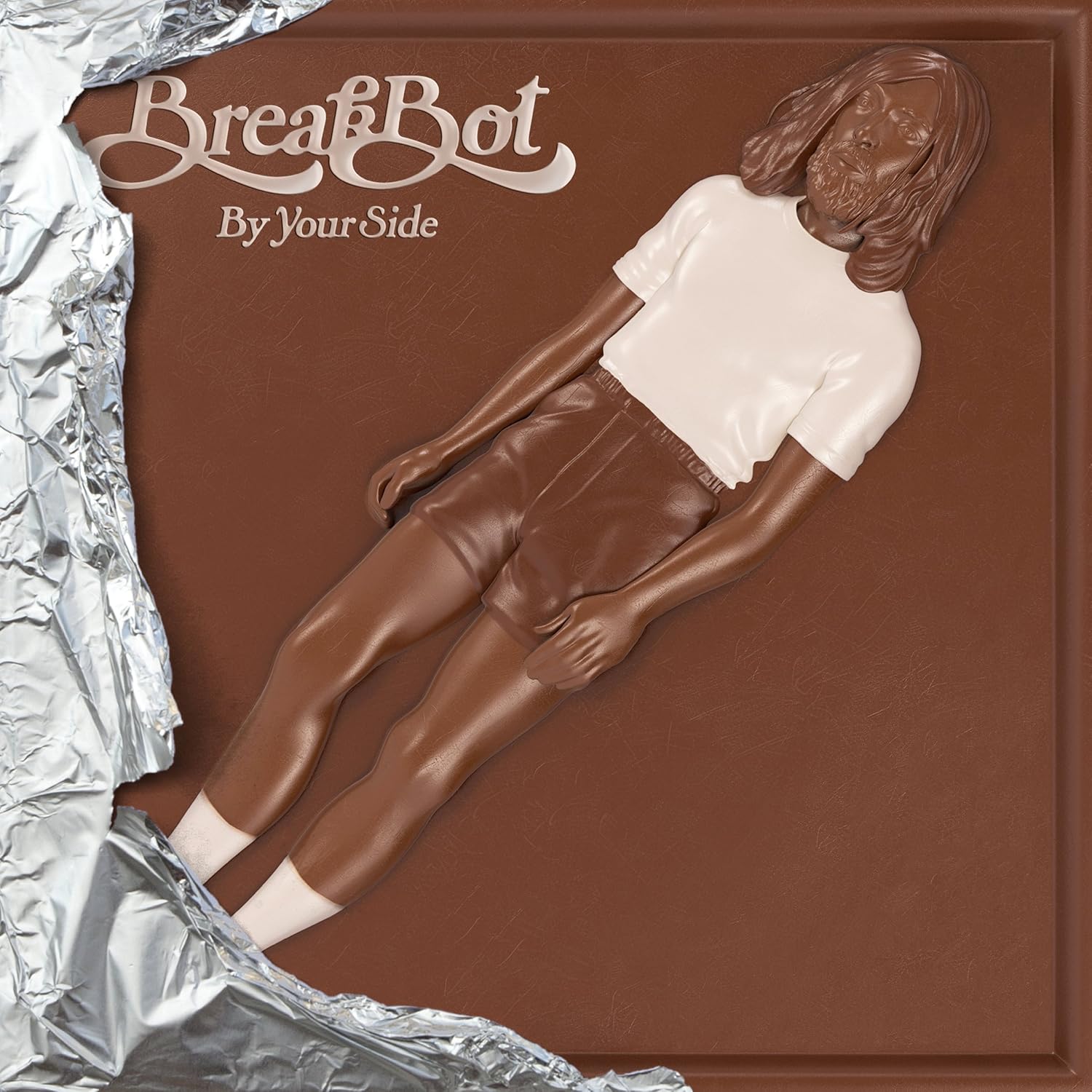
This is the cover art for the album 'By Your Side' by French Disco/Electro artist Breakbot. Like the other two albums, it is a disco influenced electro-pop album, but incorporates a more organic and lively orchestrated aspect. Where as the other two albums rely more on the use of synths and samples, By Your Side's compositions include many live sounding instruments, with samples of bass guitars, strings, piano and other acoustic instruments featuring in the mix. In addition, the song writing takes a more laid-back and luscious tone, creating chilled out funk love songs with various vocal collaborators. This is all reflected in the artwork and packaging, which presents the album as if it were a half unwrapped chocolate bar. This artwork, itself a variation on a common theme throughout Breakbot's artwork [2] [3], and helps to maintain and attract Breakbot's loyal audience. It connotes the smooth and rich tone of the album, and its complex instrumentation, by suggesting the rich, smooth taste of chocolate with the chocolate texture. It is also a very aesthetically interesting and alluring cover, playing with the very concept of album artwork itself by packaging it as an entirely different product. I feel it is a very successful and interesting cover and will consider it when designing mine.
Cut Copy-Bright Like Neon Love

This is the cover art for the album 'Bright Like Neon Love' by the Australian Synth-Pop band Cut-Copy. The genre of this release can be best described as a cross between the warm, disco-influenced electro-pop of bands like 'The Human League' and the effect pedal laden indie-rock of bands like My Bloody Valentine. The use of a woman wearing bright lipstick and sunglasses is a common electronic trope more commonly associated with the camp and futuristic aesthetic of the electro-clash scene of the mid 00's, that Cut Copy related to. This is accentuated by the use of the reflection of New York city in the sunglasses, re-enforcing the high glamour and sheen of the electro genre. The indie genre is also reflected in the cover, with the use of the photo-montage technique, which connotes the DIY aspect of the music. This is a good album cover that communicates the style of the music well, meaning it is appropriate for the purpose.
Tuesday, 3 March 2015
Print Productions // Completed Digipak + Advert
This is the completed Digipak I have produced for the imaginary album 'Suede' by un-imaginary independent British producer Vanilla. It is a simple 6 panel design that folds out and packages a single disc. With my design I wished to continue to explore the theme of how we interact with technology, with romance and with the two together.


This is the layout that I have used for my Digipak, and when explaining each panel, these are the numbers each panel will correspond to.
Tuesday, 27 January 2015
Print Production Planning // Planning Revision [27/01/2015]
In light of recent events, I am going to have to drastically change my planning. I had originally planned my Print Production to feature 2 anonymous characters that linked thematically to the music video, rather than literally or narratively. I had drawn out several rough designs exploring this theme and explained why I wanted to represent them in a certain way. I showed and explained these designs to my tutor before the photoshoot and she expressed her approval of the designs.
However, I have now been told that the designs and the photos I took on the photoshoot are not appropriate for the task, and should be discarded. This means I will have to re-design much of the Print Production, in light of these developments. Though this is inconvenient, I feel I will still be able to make a good print production, and I am helpfully proficient with Photo-Shop. The photoshoot and previous designs have been useful still, as they were a good learning experience that will help to inform my renewed planning. The next stage is to look at what planning and what photos I do have and evaluate how I may use them, before moving on and starting the design process once more.
However, I have now been told that the designs and the photos I took on the photoshoot are not appropriate for the task, and should be discarded. This means I will have to re-design much of the Print Production, in light of these developments. Though this is inconvenient, I feel I will still be able to make a good print production, and I am helpfully proficient with Photo-Shop. The photoshoot and previous designs have been useful still, as they were a good learning experience that will help to inform my renewed planning. The next stage is to look at what planning and what photos I do have and evaluate how I may use them, before moving on and starting the design process once more.
Monday, 26 January 2015
Print Production Planning // Photo-Shoot Rushes
These are all of the rushes I took during the photo-shoot, intended to proivde me with the material and inspiration I need to plan my Print Production. The photos you can see here will most likely be fairly different in the final product, as I intend to edit, twist and glitch the photos before they can be used in my production. I have left in all the photos, ones which I may use and ones which I won't, because it can be useful to see unused photos, for inspiration and evaluation purposes, if nothing else. With the completion of the Photo-Shoot and the rough design stage now completed, I can move onto getting some more of the technical side of my print production.
Print Productions Planning // Shoot Moodboard
In my print productions, my rough sketches so far all incorporate use of photography and staging in their designs. In order to collect the materials I need for the print production and to hopefully gain some more inspiration, I have arranged a photo-shoot and now need to plan it out.
The general theme I'm going for with the cover is the alienation caused by our increasing use and reliance on communicative technology. I plan to show two characters ( female, due to the woman's idealised and objectified position in society) who are supposedly intimate (maybe holding hands/embracing) but distanced, their faces obscured by technology. This obscurity may come from something as simple as a screen blocking their faces, to a digital glitch breaking an element of a digital file. For this I have booked two models who will act for the photoshoot, and have given them instructions to wear suits with large amounts of jewellry. I have chosen this kind costume because I feel it accurately connotes the mood of impersonality and loss of identity (through the suit) and also the vanity and superficial materialism (through the jewellery) perpetrated by technology.
Whilst thinking about these issues, and to help inspire myself, I created a moodboard of the vague aesthetics and themes I wished to explore on the album cover. This reflects the general mise en scene I wish to create and some of the inspiration I have incorporated.

Whilst thinking about these issues, and to help inspire myself, I created a moodboard of the vague aesthetics and themes I wished to explore on the album cover. This reflects the general mise en scene I wish to create and some of the inspiration I have incorporated.
I will post the results from the photoshoot shortly.
Saturday, 17 January 2015
Print Productions Research // The Evolution of Of Montreal's Album Artwork.
Of Montreal (often stylized with a lower case 'o' as 'of Montreal') are an american indie rock band hailing from the city of Athens, Georgia. In more recent years, the band has built up a reputation for its wildly theatrical and flamboyant stage shows, with their sets incorporating flashy costumes, spoken word skits, on stage actors and extravagantly complex stage sets. one of these shows can be seen here (shame about the crowd though). Throughout their 17 year career the band has gone through a series of line-up changes, but has always been led by main songwriter and front-man Kevin Barnes whose extroverted and tortured personality has informed his duties as primary songwriter, stage producer and performer. Along with a constantly changing line-up, the band have also constantly experimented with a wide variety of different genres throughout their career, touching upon styles as varied as 60's acoustic pop, glam rock, disco, noise rock and electronica, as well as many more. This constantly changing tapestry of genres is reflected in the evolving artwork for their many releases. On this occassion however I will only be focusing on select examples of artwork for their 12 full length studio albums and, for now, ignoring the rest of their (very) prolific discography.
Wednesday, 14 January 2015
Music Video Planning // Character + Costume
Now that my storyboard is complete (viewable here), I will plan out in further detail the many aspects of my music video. The first I wish to plan is the characters in the music video , the representations of said characters and how these representations will be constructed (namely through costume).
There are only 2 characters in the music video, the man who falls in love with his TV and the girl on the TV Screen. The characterisation of both of these characters is important, but of particular importance is the man, as he is the protagonist and focal point for the video. The Girl is comparatively unimportant, both because she is not the protagonist, but also as a fundemental part of her character itself, an illusion that the man allows himself to become involved in.
I have chosen to name the man Dave, as an intertextual reference to the character of Dr. Dave Bowman, From classic Sci-Fi '2001: A Space Odyssey'. I have chosen to use this reference due to the immortal exchanges between him and the ship he occupies' artificial intelligence H.A.L. 9000. I have chosen this because it reflects the relationship between man and technology also represented in my music video. Similarly, I have chosen to name the girl on the TV Scarlett, as a reference to the actress Scarlett Johansson, as she plays the role of the OS Samantha in the film 'Her'. I have chosen to so this because the character of Samantha is highly similar to my music video's character, as she is an artificial technological construct that a real, human man falls in love with.

By design, The character of Dave will need to exhibit certain characteristics, so it is important to costume and direct the actor in the correct way. To connote his eccentricity and his light abnormality, he needs to be dressed in a way that is also eccentric and er, slightly abnormal. I have created a mood board of influences to help inspire the character, and his costume.
There are only 2 characters in the music video, the man who falls in love with his TV and the girl on the TV Screen. The characterisation of both of these characters is important, but of particular importance is the man, as he is the protagonist and focal point for the video. The Girl is comparatively unimportant, both because she is not the protagonist, but also as a fundemental part of her character itself, an illusion that the man allows himself to become involved in.
I have chosen to name the man Dave, as an intertextual reference to the character of Dr. Dave Bowman, From classic Sci-Fi '2001: A Space Odyssey'. I have chosen to use this reference due to the immortal exchanges between him and the ship he occupies' artificial intelligence H.A.L. 9000. I have chosen this because it reflects the relationship between man and technology also represented in my music video. Similarly, I have chosen to name the girl on the TV Scarlett, as a reference to the actress Scarlett Johansson, as she plays the role of the OS Samantha in the film 'Her'. I have chosen to so this because the character of Samantha is highly similar to my music video's character, as she is an artificial technological construct that a real, human man falls in love with.
By design, The character of Dave will need to exhibit certain characteristics, so it is important to costume and direct the actor in the correct way. To connote his eccentricity and his light abnormality, he needs to be dressed in a way that is also eccentric and er, slightly abnormal. I have created a mood board of influences to help inspire the character, and his costume.
Subscribe to:
Comments (Atom)